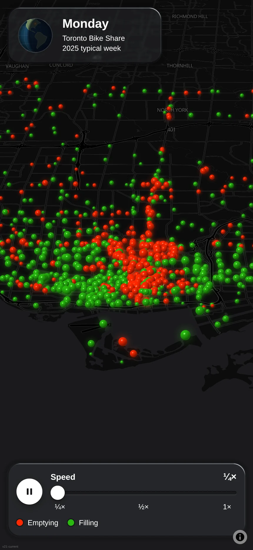
Every trip on Toronto's bike share system is public. Pulse folds a year of them, 7.3 million trips in 2025, into one typical week and plays it back, hour by hour.
Each sphere is a station. Its size is how fast bikes are arriving or leaving, and its colour says which. In the morning the downtown core turns green as commuters ride in, and in the evening it turns red.
Tilt, turn and zoom the map while it plays.
What's inside
- All the counting is done once, ahead of time. The phone downloads a small file and only looks things up, so there is no server to wait for.
- The spheres are drawn by a WebGL shader written for this app: one flat square per station, shaded to look round.
- The speed control stops at 1×. The data is hourly, and any faster the spheres can no longer keep up with the clock.